The graphical elements of the identity follow closely the architectural project: light glass and terrace-oriented building, whose lucky future inhabitants will have the pleasure of admiring the Rotterdam skyline straight from their luminous living-rooms.
The handout presented above introduced the project and its identity to the public.
The little red booklet presented below was used as an opening ceremony program, and it officially closed the campaign.
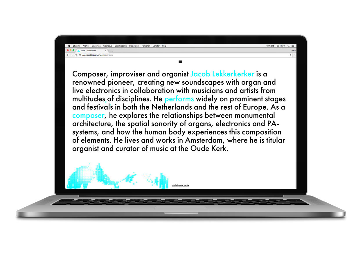
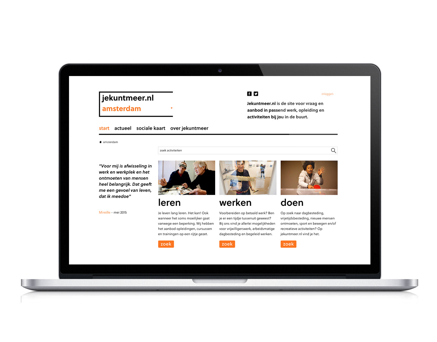
An important part of the whole campaign was communicating the progress of the project to the public. We designed a fully responsive and functional website, which – besides featuring news, events, videos and the developer’s announcements, contains also a timeline which shows the rich history of the building and the neighbour. After all, a lot has happened in the place of the current Timmerhuis building, and it was crucial to show its rich tradition.

